Showing posts with label ballparks. Show all posts

Thursday, February 18, 2010

Ballpark Wall Colors - Keep The Black!


Like with ballpark seat colors, green is by far the color of choice in major league ballparks. More than two-thirds of the 30 major league ballparks have green walls.


Twenty One MLB parks have green walls: Angel Stadium, Fenway Park, Rangers Ballpark, Target Field, Comerica Park, Safeco Field, Tropicana Field, U.S. Cellular Field, Kauffman Stadium, Progressive Field, Oriole Park, Citizens Bank Park, Coors Field, Busch Stadium, AT&T Park, Great American Ballpark, Minute Maid Park, Chase Field, PNC Park and Nationals Park.


Blue walls are the second-most used in MLB. Unlike green though, there is actually variety of shades of blue in use. Yankee Stadium has uses a navy blue color. Turner Field, Rogers Centre, and Miller Park have more of a royal blue color. Dodger Stadium seems to have almost a powder blue color. The walls at Petco Park in San Diego are a very very dark blue. (***I'm not 100% sure of this, it is possible that they are black.)


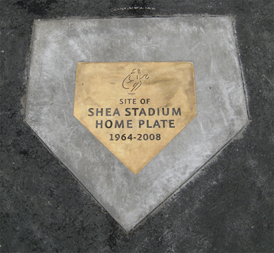
Citi Field is the lone ballpark in the majors with black walls. While many Mets fans feel they should revert to the royal blue color that was used at Shea Stadium, I find the black walls to be striking and unique. Whenever you see the black walls in a highlight package, you instantly know what park it is. In a league where 90% of the ballparks use green or blue walls this exception is refreshing. While I think the Mets should wear their traditional blue caps more (especially with the road uniforms), I hope the black walls stay for a long time.


In my opinion one of the best traditions in sports is the brick walls covered in ivy at Wrigley Field. While they're somewhat unsafe for outfielders early in the year before the ivy grows in, its a unique feature of the second oldest park in the majors.


Finally, we have the teal walls of Sun Life Stadium. While the Marlins don't use much teal in their uniforms anymore, they have chosen to keep the teal walls throughout their stay at this multi-named multipurpose stadium. Looking at the first renderings of their new retractable-dome that will open in 2012, the Marlins seem to be ready to join the green wall majority in a few years.

Wednesday, February 10, 2010

Stadium Remains - Part Two - Shea Stadium


By popular demand, here is a profile of Shea Stadium's "remains". As Citi Field was built in Shea Stadium's parking lot, Shea Stadium's remains are in Citi's parking lot. In the picture above, taken from the last row of Citi Field's Promenade, you can see the plate, all three bases and the pitcher's mound. Home plate is at the top. The parking lot was set up quite well and no cars park directly over any of the markers. They're quite easy to find and you can see dozens of fans checking them out and posing for pictures before every game. The markers are quite nice, made what seems to be a solid brass material. Each has one of the neon figures that used to adorn the bright blue Shea facade.


Here is home plate. This is the exact spot where Ray Knight triumphantly leapt onto to score the winning run in Game 6 of the 1986 World Series.


Here is the marker for the pitcher's mound. Yes, the official term in the baseball rulebook is "pitcher's plate".


Just to the south is the first base marker.


Ninety feet away is the marker for second base.


And finally, here's third base.

This is the second of an ongoing series. You can see these and thousands of other photos of current and former ballparks at StadiumPage.com.

Saturday, February 6, 2010

Ballpark Logos

One great thing about baseball and sports in general is the logos. Many people don't realize, but just about every MLB park has its own logo. The teams use them for ballpark signs and promotional efforts. The logos end up being a key part of StadiumPage.com in that they act as the link to each park's photos. Here are a few of my favorite ballpark logos


While incorporating the sponsor's logo, it still conveys the fact that its the sign for a ballpark. Simple but effective.


This one is nice because although it is a naming rights deal, if you weren't aware of the Safeco brand, you may not realize. Also it incorporates the Mariners' compass logo, which is one of the best in the game.


This is more of an anniversary logo, but I still consider it a ballpark logo. I like how it incorporates the old look of Shea from 1964 through the early 80's on the left side along with the 1980's forward blue/neon look.


One of the few ballpark logos that actually has an image of the park in it. I think its also supposed to look like a political campaign button which is appropriate to Washington DC.


This is a rarely seen alternate version of the Citizens Bank Park logo. It incorporates the signature Neon Liberty Bell from Right Field along with the field's shape. Simple and effective. The Phillies should use this version more.


Like Miller Park, this one is able to incorporate the sponsor's logo with the club's. The growling tiger along with the bats and the ballpark's signature steel arches are all present. A nice way to sum up an underrated ballpark.


Its too bad that the original Yankee Stadium gates were lost in the 1970's renovation. The designer did a nice job pulling them into this final season logo. Great logo for one of the classic parks.


That's just some of my favorites. You can see more on StadiumPage.com .

Wednesday, February 3, 2010

Stadium Ratings/Rankings - I

In the 12 years StadiumPage.com has been active, I've never felt the need to rank/rate the ballparks I've been to. In my view, anywhere they play baseball is ok with me. Regardless, everyone has favorites and these are mine:
(In no particular order)

- Citi Field: It gets alot of criticism for being "too Dodgers" and some questionable siteline decisions, but it really is a great park. The outside and rotunda entrance are really well done. It has interesting outfield fence dimensions, which while somewhat "gimmicky" lead to a different type of game being played. Of the 28 parks I've been to, Citi has by far the best concessions. Once the Mets get a top caliber team in the place, the minor problems will be forgotten.


- AT&T Park: The view of the San Francisco Bay is incredible. SF is a great town in general and the ballpark really fits in well. I haven't there since its inaugural season in 2000, but I'm sure it has aged well in the past 10 years.


- Oriole Park at Camden Yards: Its the park that started a revolution. I really like the "steel and brick" parks, so as the original I find this one great. Unlike alot of the newer descendants, this park is gimmick free. When you go inside, it seems like its been there for 50 years rather than the 18 or so that it has been open.


- Fenway Park: Of the "classic parks" this is my favorite. Unlike the original Yankee Stadium, Fenway's many facelifts haven't taken away its ageless charm. It really fits in its neighborhood, if you didn't know better you would think that its just another warehouse or office building. The Green Monster and other quirks make it incredibly interesting.


- PNC Park: PNC has the best skyline view of them all. Plus it has the view of the river and the Clemente bridge beyond the RF fence. Its limestone exterior is unique and differentiates it further from the others.

These are my favorites, what do you think?