Showing posts with label Nationals. Show all posts

Thursday, February 25, 2010

Figural Row Ends - Volume 1 - NL East

"Figural Row Ends" (aka Figural Seats) are the logos that are cast on the end of a row at a ballpark. I'm sure they go unnoticed by most fans, but they're an interesting touch that really personalizes the ballpark. Sometimes they have the park's logo and sometimes the team's logo. While a lot of the multipurpose stadiums from the 60's and 70's did not have this feature, the tradition goes back to baseball's beginnings. They were seen in parks as far back as Cincinnati's Crosley Field and New York's Polo Grounds.

In this blog entry, I'll go through the figural row ends of the National League East.


Citizens Bank Park


Starting with the three-time defending champs of the NL East, the Citizens Bank Park row ends feature the team's logo. With the ballpark's large neon liberty bell that rings for home runs, it was natural for the Phillies to use the liberty bell logo on the seat ends. Along with the bell is the Phillies script logo.


Citi Field


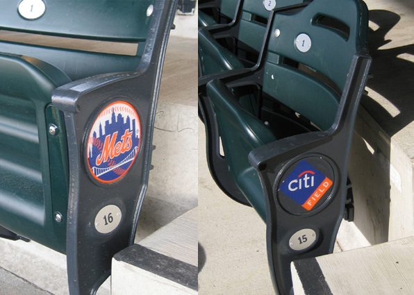
The NL East's newest ballpark, Citi Field, features two different row ends. The two logos alternate from row to row. One row has the Mets logo and the next has the Citi Field logo. Unlike most of the row ends in the league, Citi Field's are actually just a blank circle on the iron with a big sticker on it. While it seems cheap, its probably a good idea to have replacable logos when your naming sponsor is basically under government control.


Turner Field


The row ends at Turner Field in Atlanta are very interesting. The red script Braves logo catches the eye, but behind it seems to be a silhouette of the great Hank Aaron in a home run swing. Behind Hammerin' Hank is the outline of a baseball field. Its all cast in iron right on the row end.


Nationals Ballpark


Nationals Ballpark keeps it pretty simple. A simple version of the Nationals' "Curly W" logo is cast onto the side of the seat post.


SunLife Stadium


At SunLife Stadium (formerly Dolphin Stadium and Landshark Stadium), the row ends feature the logo not of the stadium or the Marlins, but the logo of Marlins current landlord the Miami Dolphins. With the Marlins slated to open their new park in 2012 this will change.

Check out these and many other images at StadiumPage.com.

Tuesday, February 23, 2010

Unrealized Concepts - Volume 3 - Labatt Park


Shortly after Jeffery Loria took over the Montreal Expos, plans were announced for a new ballpark in downtown Montreal. For the Expos' entire tenure in Montreal they had played in the "upgraded" Jarry Park and the cavernous Olympic Stadium. The plan called for a unique baseball only stadium. Unlike most of the new parks which opened in the late 90's, the new park would have a steel skin rather than brick.


Oddly, the announcement of the stadium came complete with the park's name Labatt Park. The park would be located within the "downtown" area of Montreal and was slated to have an incredible skyline view.


Unfortunately, the Expos were not able to get a financing deal in place and Labatt Park never came to be. The Expos were sold to MLB in a strange three team transaction where Loria came to own the Marlins and the Marlins owners bought the Red Sox.


Nationals Park


The rest was history. After a few years in Montreal under MLB control, the Expos were moved to Washington D.C. and became the Nationals. Oddly enough, in 2008 the Nationals opened their new ballpark which has a steel exterior which is very similar to the proposed Labatt Park design.

You can see these and more images of Labatt Park at StadiumPage.com.

Saturday, February 6, 2010

Ballpark Logos

One great thing about baseball and sports in general is the logos. Many people don't realize, but just about every MLB park has its own logo. The teams use them for ballpark signs and promotional efforts. The logos end up being a key part of StadiumPage.com in that they act as the link to each park's photos. Here are a few of my favorite ballpark logos


While incorporating the sponsor's logo, it still conveys the fact that its the sign for a ballpark. Simple but effective.


This one is nice because although it is a naming rights deal, if you weren't aware of the Safeco brand, you may not realize. Also it incorporates the Mariners' compass logo, which is one of the best in the game.


This is more of an anniversary logo, but I still consider it a ballpark logo. I like how it incorporates the old look of Shea from 1964 through the early 80's on the left side along with the 1980's forward blue/neon look.


One of the few ballpark logos that actually has an image of the park in it. I think its also supposed to look like a political campaign button which is appropriate to Washington DC.


This is a rarely seen alternate version of the Citizens Bank Park logo. It incorporates the signature Neon Liberty Bell from Right Field along with the field's shape. Simple and effective. The Phillies should use this version more.


Like Miller Park, this one is able to incorporate the sponsor's logo with the club's. The growling tiger along with the bats and the ballpark's signature steel arches are all present. A nice way to sum up an underrated ballpark.


Its too bad that the original Yankee Stadium gates were lost in the 1970's renovation. The designer did a nice job pulling them into this final season logo. Great logo for one of the classic parks.


That's just some of my favorites. You can see more on StadiumPage.com .